Blazor - Component Mockup Library
This article we will go over the EventHorizon Blazor Mockup library, simplifying the process of building, documenting, and testing Blazor/Razor Components.

Background
This library is influenced by the JavaScript tool Storybook, a tool that allows for the developing of UI components. Same with Storybook EventHorizon Blazor Mockup allows for you to build, document, and test UIs. But instead of building the UIs in JavaScript it uses Blazor as the Framework keeping the whole process of developing the Mockups in C#.
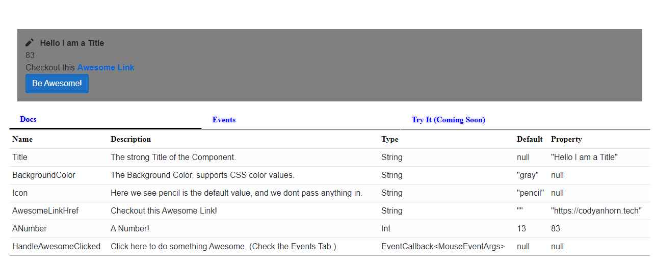
Right now the Library has a single component that you can pass in your root Razor Component and it will parse this Type and create high-level details about the Component. Mockup has extension points that you can use to enhance details about the Component like Description, the default value of the component, and the value to use in the Property. The major areas right now are a Documentation details, the triggered EventCallbacks with argument details, and a Canvas showing the running example. The Documentation shows the Type of any [Parameter] attributes on the Component, and will be enriched with details from the passed in Arguments. The Events tab will log triggered EventCallbacks to the Component, also serializing the data into a json format.
Getting Started
Make sure the SDK your are using is .NET5, there are issues with .NET6.
1) Here we are going to create a new Blazor Server application, this make it quicker to iterate, but any the below steps can also be done in the context of Blazor Wasm.
# Create Fresh dotnet new blazorserver
dotnet new blazorserver
# Install EventHorizon.Blazor.Mockup
dotnet add package EventHorizon.Blazor.Mockup
2) Add Theming to match default blazorwasm styles
<link href="_content/EventHorizon.Blazor.UX/ehz-blazor-ux-theme.css" rel="stylesheet">
3) Add this to the wwwroot/css/site.css to theme the component to the Base theme used by a new Blazor application.
:root {
    --default-animation-speed: 1000ms;
    --font-family: 'Electrolize', 'sans-serif';
    --main-foreground-color: black;
    --main-background-color: white;
    --main-foreground-shadow-color: black;
    --main-accent-color: black;
    --main-accent-shadow-color: black;
    --disabled-background-color: #d6d5d5a6;
    --call-to-action-color: blue;
    --call-to-action-shadow-color: rgba(0, 0, 255, 0.3);
    /* Tabs */
    --tabs-select-border-hover-color: black;
    /* Table */
    --table-head-color: black;
    --table-row-color: rgba(0, 0, 0, 0.325);
    --table-row-alternate-background-color: rgba(251, 249, 251, 0.1);
}

.tabs-area__tab-select {
    font-weight: bold;
}
4) Below is an Awesome UI, this is a complex component with a few parameters that can be used to customize the UI. Name the file AwesomeUI.razor, and put it in a place that the Index.razor can access, this will give us a component to display the Mockup of.
<div style="background: @BackgroundColor; padding: 1rem" class="mt-4" role="alert">
    <span class="oi oi-@Icon mr-2" aria-hidden="true"></span>
    <strong>@Title</strong>

    <div>@ANumber</div>

    <span class="text-nowrap">
        Checkout this <a target="_blank" class="font-weight-bold" href="@AwesomeLinkHref">Awesome Link</a>
    </span>
    <div>
        <button class="btn btn-primary" @onclick="HandleAwesomeClicked">Be Awesome!</button>
    </div>
</div>

@code {
    [Parameter]
    public string Title { get; set; }
    [Parameter]
    public string BackgroundColor { get; set; } = "gray";
    [Parameter]
    public string Icon { get; set; } = "pencil";
    [Parameter]
    public string AwesomeLinkHref { get; set; } = string.Empty;
    [Parameter]
    public int ANumber { get; set; } = 13;
    [Parameter]
    public EventCallback<MouseEventArgs> HandleAwesomeClicked { get; set; }
}
5) Here is our AwesomeUI component displayed in the ComponentMockup, telling us about the Parameters and giving us feedback on EventCallbacks.
<ComponentMockup ComponentType="@(typeof(AwesomeUI))"
                 Arguments="@(
            new ComponentArgumentDetailsMap {
                ["Title"] = new()
                {
                    Description = "The strong Title of the Component.",
                    DefaultValue = null,
                    PropertyValue = "Hello I am a Title",
                },
                ["BackgroundColor"] = new()
                {
                    Description = "The Background Color, supports CSS color values.",
                    DefaultValue = "gray",
                },
                ["HandleAwesomeClicked"] = new()
                {
                    Description = "Click here to do something Awesome. (Check the Events Tab.)",
                    DefaultValue = null,
                },
                ["AwesomeLinkHref"] = new()
                {
                    Description = "Checkout this Awesome Link!",
                    DefaultValue = "",
                    PropertyValue = "https://codyanhorn.tech",
                },
                ["ANumber"] = new ()
                {
                    Description = "A Number!",
                    DefaultValue = 13,
                    PropertyValue = 83,
                },
                ["Icon"] = new()
                {
                    Description = "Here we see pencil is the default value, and we dont pass anything in.",
                    DefaultValue = "pencil",
                },
            })" />
Source Code
The above source code can be viewed in this GitHub Repository, that repository will be updated as new features are added to the EventHorizon Blazor Mockup. You can checkout the canhorn/EventHorizon.Blazor.UX repository for more details on the UX library that Mockup is used by and builds on top of.

